Ovarian Cancer Action is the UK’s leading ovarian cancer charity, focussed on improving ovarian cancer survival rates through knowledge, breakthroughs and fairness.
The team at Revolt was tasked with giving the brand a fresh new look that not only embodied their purpose and tone of voice, but also inspired action.
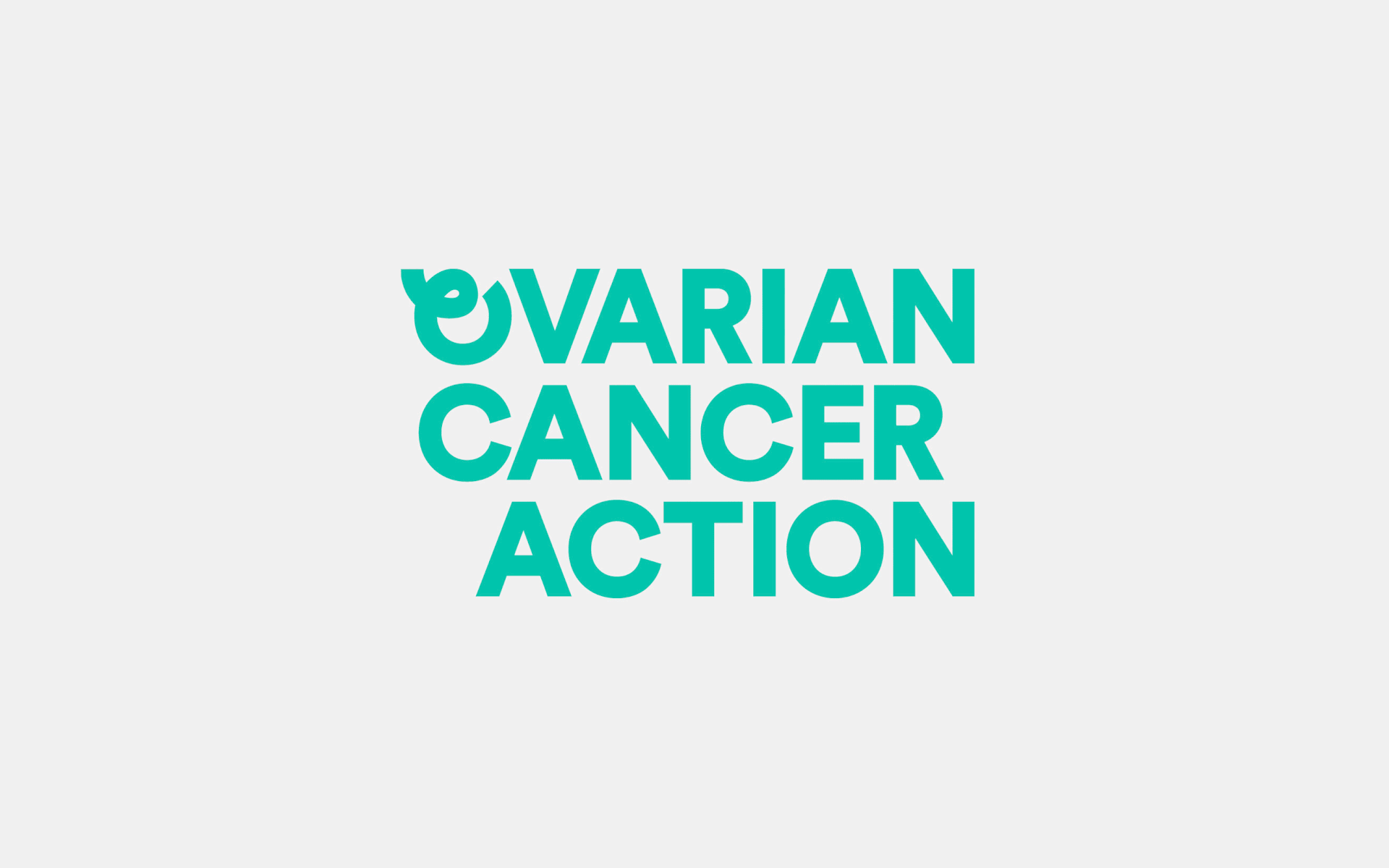
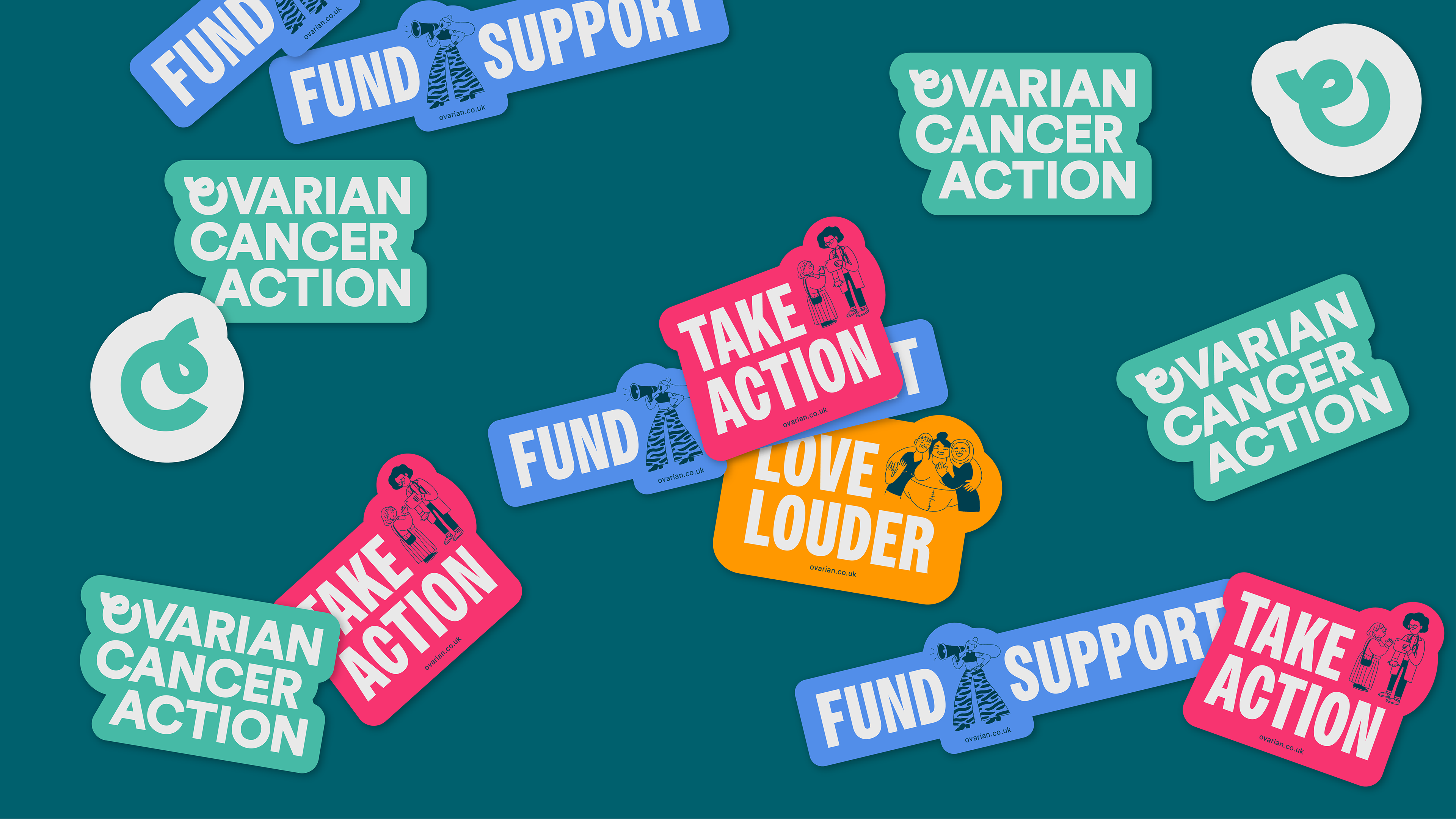
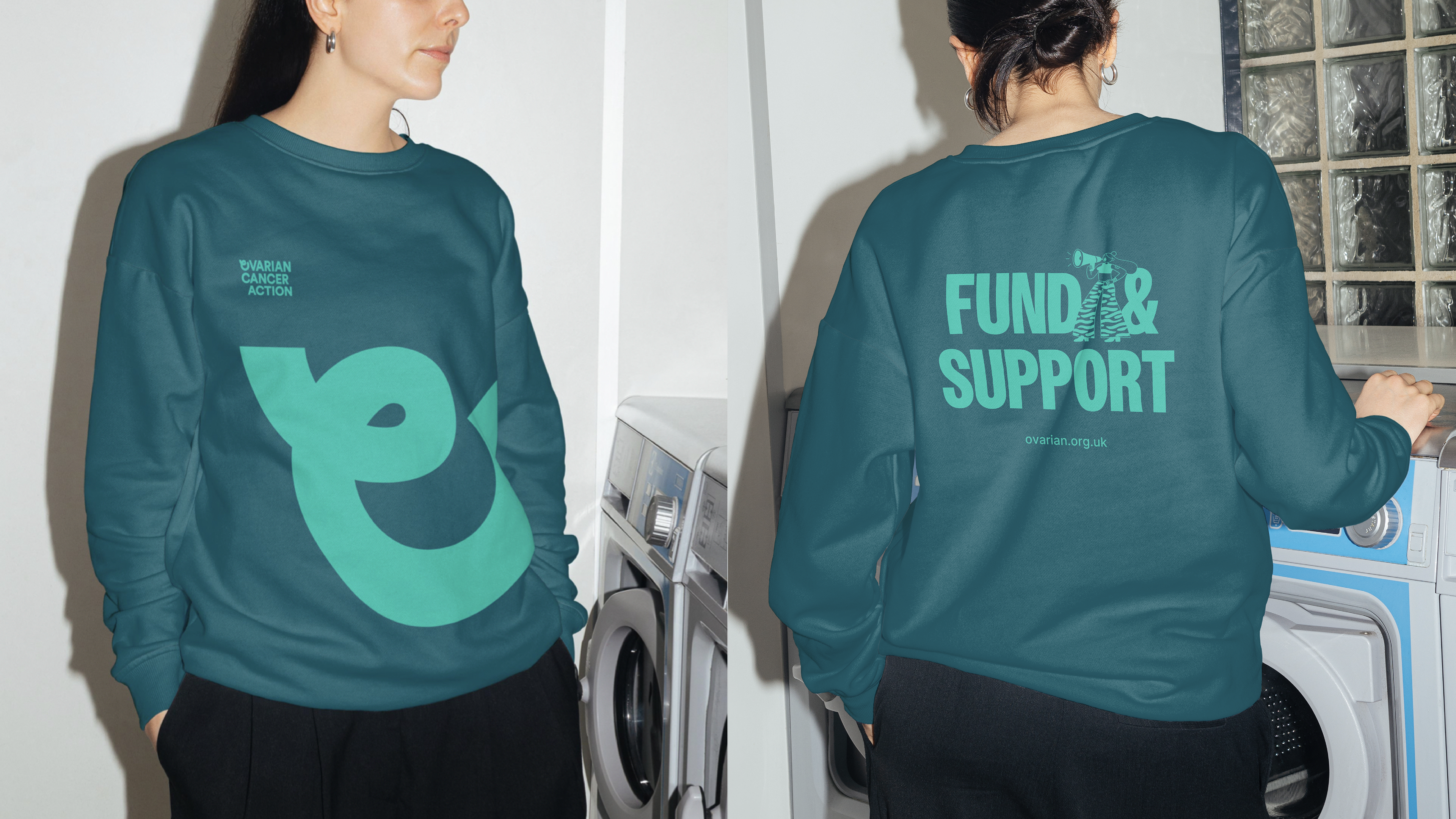
At the core of OCA's brand lies a steadfast commitment to action, therefore the logo we created is characterised by the intentional offsetting of type, and serves as a visual representation of the brand’s commitment to inspire urgent action.
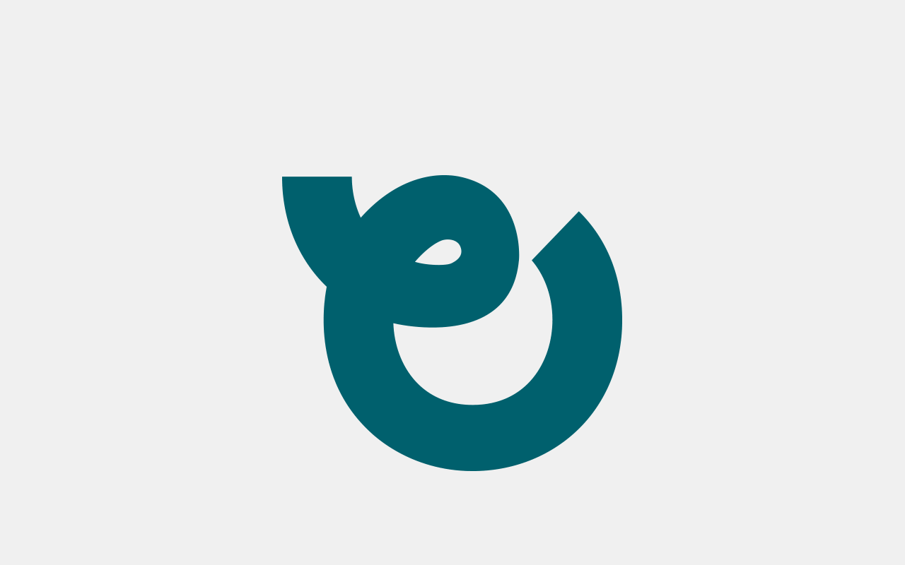
The brand mark is inspired by a widely recognised cancer symbol.
By incorporation elements of the cancer ribbon while also representing a swollen ovary (a symptom of ovarian cancer) the mark serves as the cornerstone graphic element for the brand.
By incorporation elements of the cancer ribbon while also representing a swollen ovary (a symptom of ovarian cancer) the mark serves as the cornerstone graphic element for the brand.

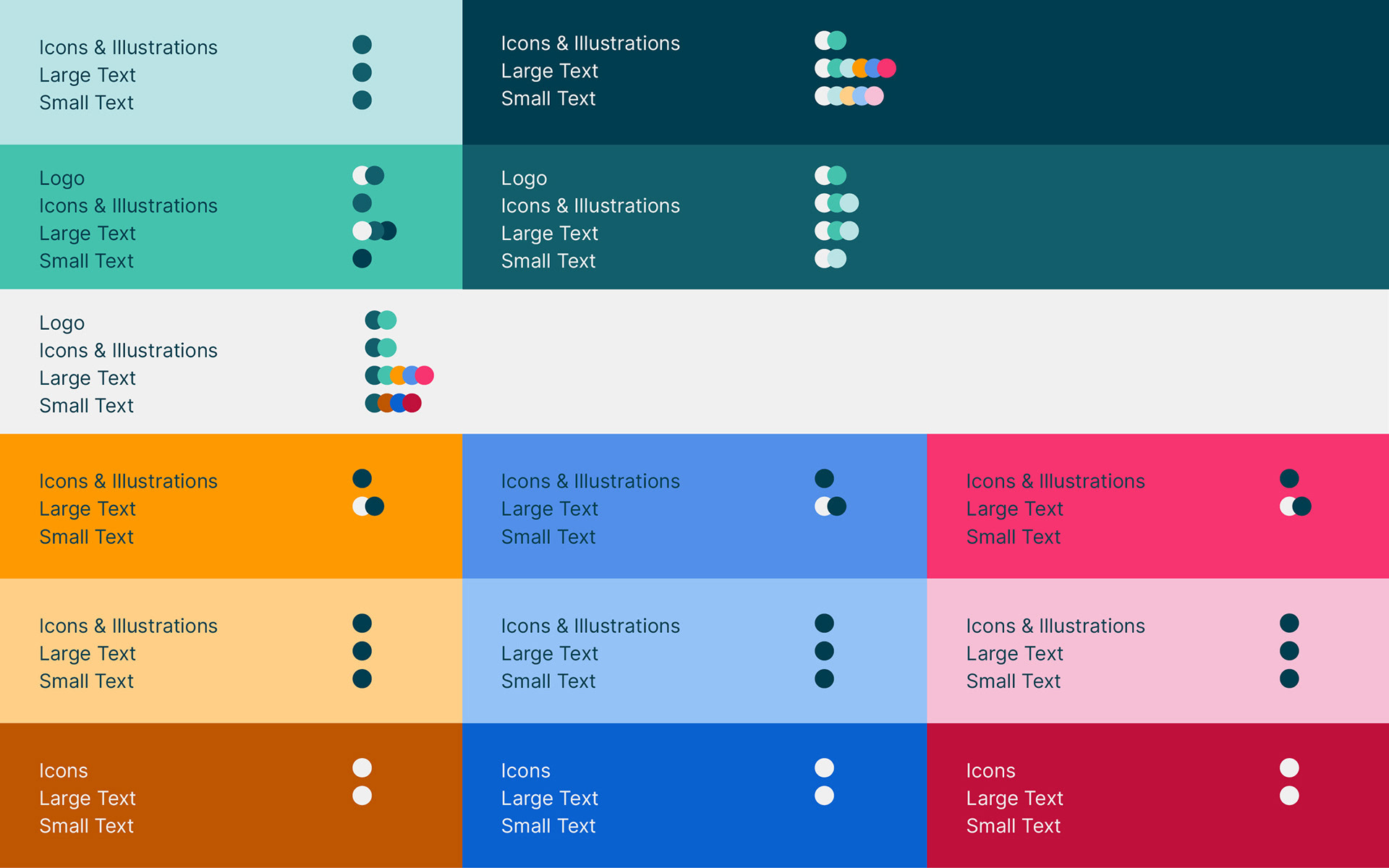
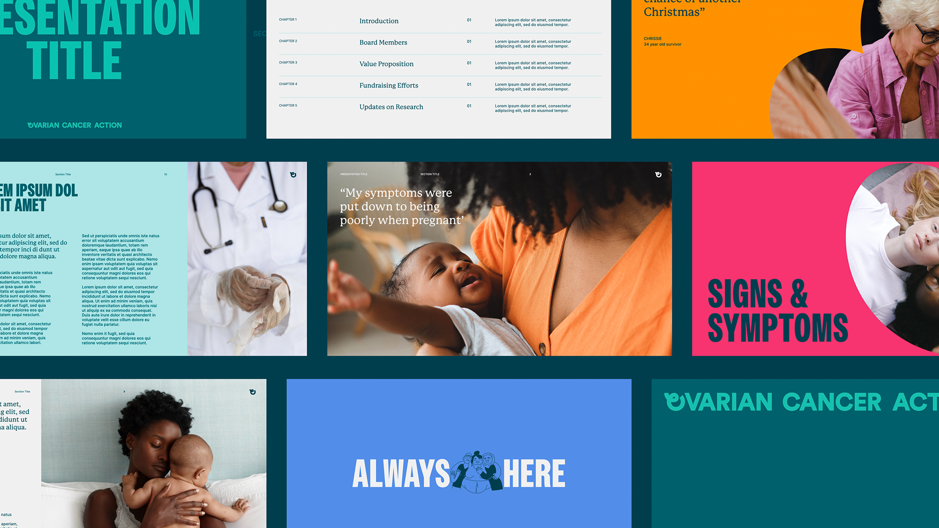
Teal is the colour for ovarian cancer, and sits at the core of OCA's brand, ensuring both impact and memorability.
Adding to the visual identity are the Action colours informed by the tone of voice — Energy Orange, Expert Blue, and Urgent Pink. These not only complement the primary teal but also symbolise OCA's proactive and bold stance in raising ovarian cancer awareness.
Ovarian Cancer Action recognises the critical importance of accessibility and integrates it into every facet of their rebrand.
From the selection of fonts and colours to the creation of illustrations and graphics, our approach was meticulously crafted to cater to diverse audiences.

The brand's visual language is rooted in elements inspired by the brand symbol, creating a dynamic and adaptable design system that infuses distinctive traits into the Ovarian Cancer Action brand.

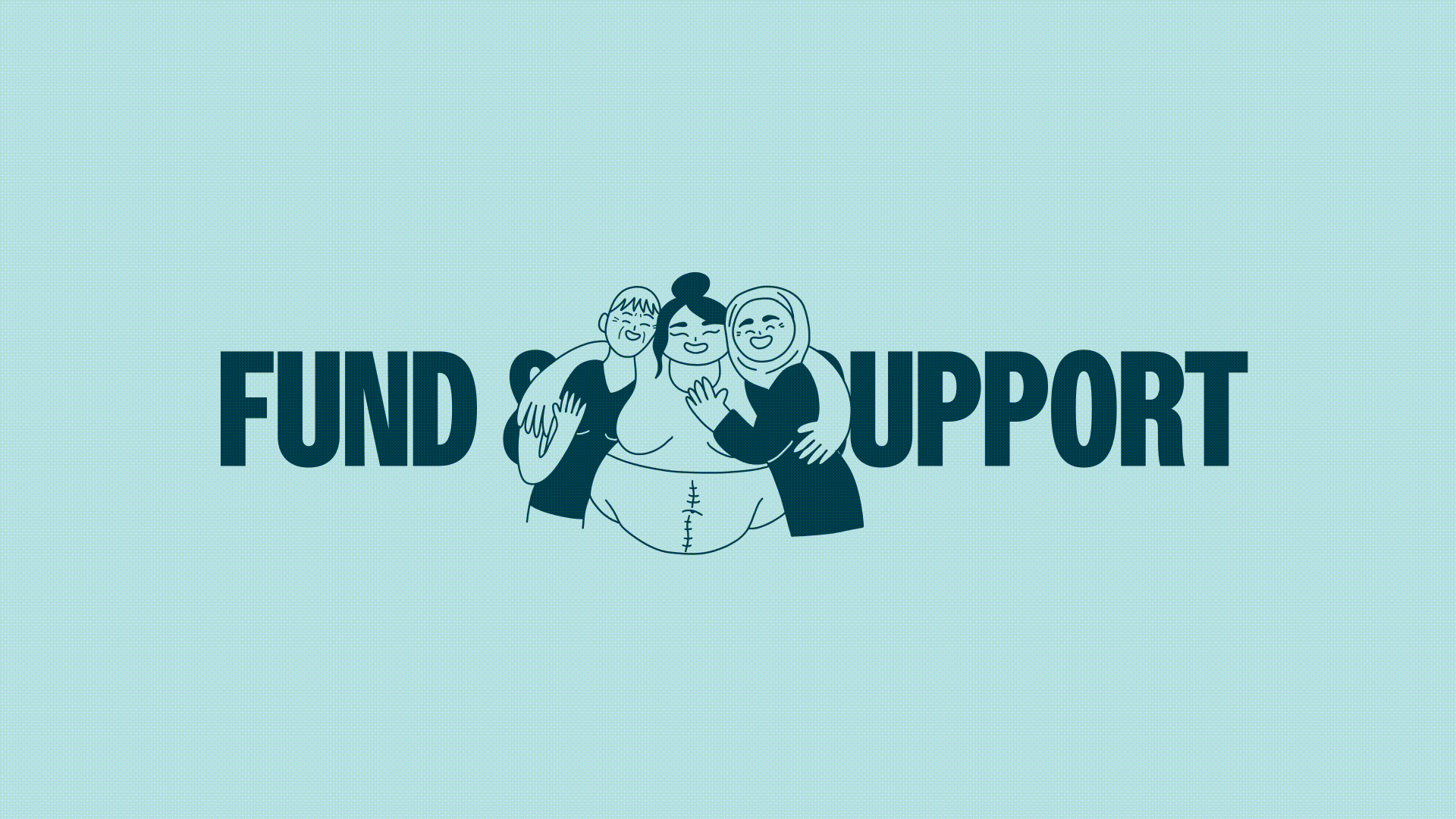
We collaborated with illustrator Cecile Dormeau to create a set of illustrations that captured key themes for the brand, including a more supportive perspective as well as the complex theme of grief.
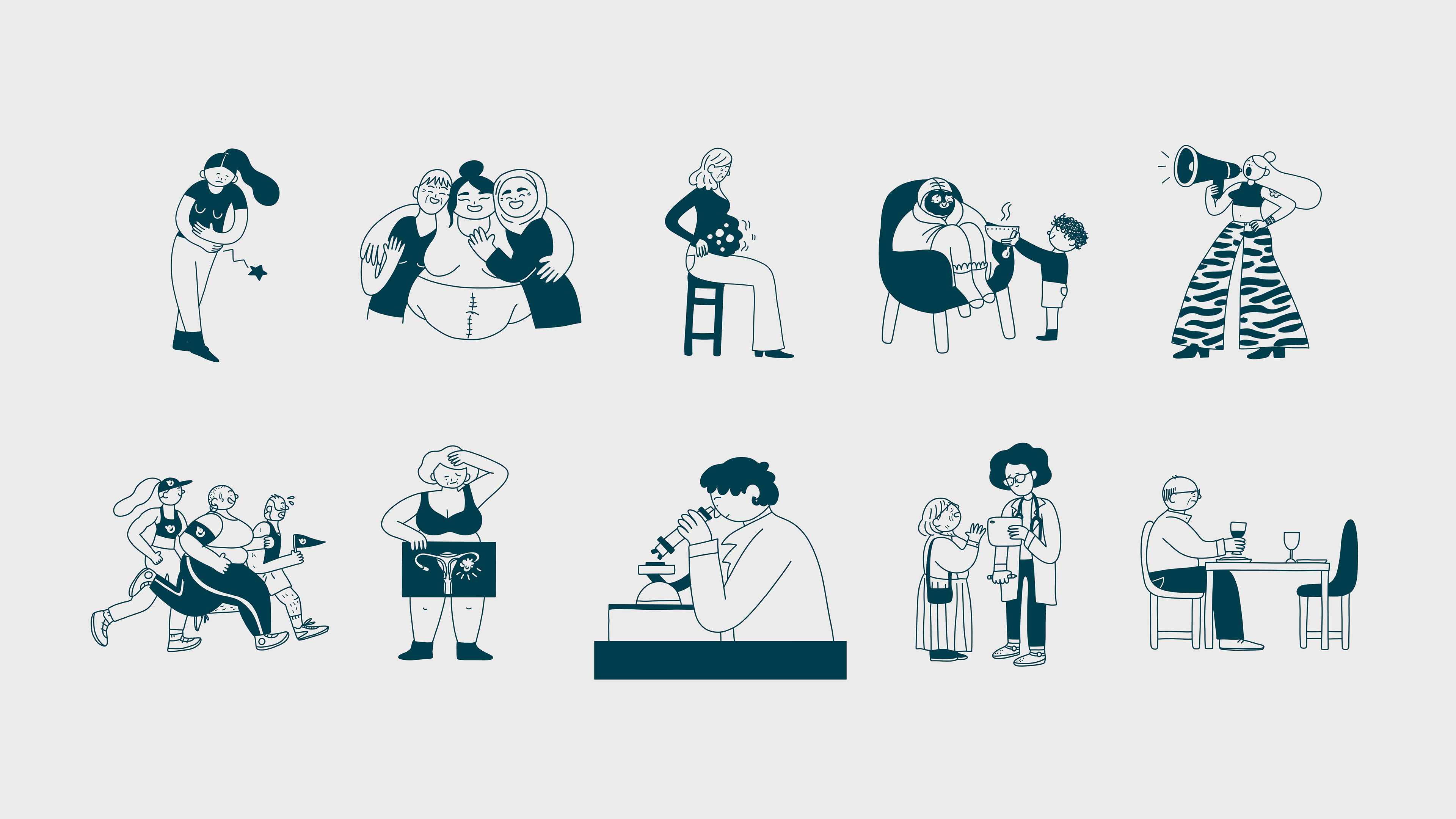

The custom iconography set takes cues from the curves of OCA's symbol, encapsulating the visual identity of the brand.


Project Credits
Revolt London
Design | Shahina Ahmed & Inês Segadães
Illustration | Cécile Dormeau
Motion | Rob Wilkes, Rowan Gill & Emma Stockton
DD | Myron Darlington
Revolt London
Design | Shahina Ahmed & Inês Segadães
Illustration | Cécile Dormeau
Motion | Rob Wilkes, Rowan Gill & Emma Stockton
DD | Myron Darlington